Re…

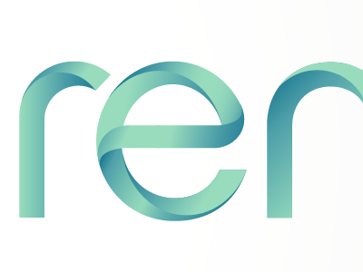
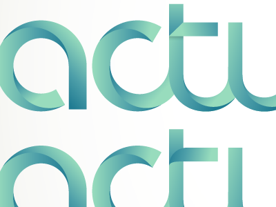
Still working on this logo... The design I showed my client only had part of the name in this style because the name is a junction of 2 words, and so I thought it would be interesting to play with that a bit and use a different styling for both 'words', but the client found the difference between the 2 a bit too obvious and wanted to see how things look if this curvy style was executed on the entire name. The 'e' was a challenge. As for the letter 't', it seems to me the curved one fits in best the way I showed before, because all the other letters only have curves.