Branding - Brasserie du Jorat

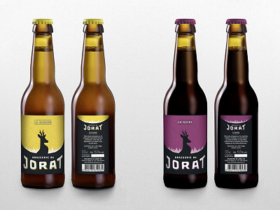
To celebrate its ten years, the Brasserie du Jorat entrusts AM Studio with the task of developing its new corporate identity. Simple and striking, it’s composed of drawn by hand graphic elements to emphasize the brewery artisanal knowledge. This choice is reflected in particular by the creation of a logotype composed with modern and irregular shapes letters. The impact is attributed to the word Jorat because it’s, on its own, the standard bearer of the region, of its customs and the products which are born there. A font, specially designed for communication purposes, is directly inspired by the logo forms.
In reference the Jorat land’s very essence, the forest and the deer were chosen and stylized to dress all the new identity constituents. In this, the Brasserie du Jorat has a strong and authentic visual code that stands out from the competition.
To enhance the craftsmanship, labels are printed on plain paper, beer packs made of kraft cardboard and gift boxes made with natural wood. The name of the beers, the color of the labels and the caps were re-examined in order to obtain the best differentiation between the seven flavors.