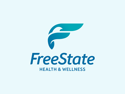
Free State Health & Wellness Brand Identity
Just wrapped up the new identity suite for Free State Health & Wellness. FSHW's primary focus is mental health and addiction care delivering individualized treatment plans that gets to the root of their patients' challenges.
The brandmark was developed around a universal symbol of peace, purity, and freedom—the dove’s wings are in a forward motion of flight, not only reflecting Free State’s mission, but also forming the letter “F.” The logotype, built from a humanist typeface by type designer Paulo Goode, was ideally customized to the identity’s brandmark. The tagline, a nod to the practice’s name, characterizes the organization and its mission.
With a vision as unique as their approach it's easy to see why the Free State Health & Wellness brand identity took flight.
Full brand identity project: http://www.lisagorham.com/free-state-health-wellness-brand-identity


