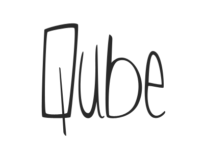
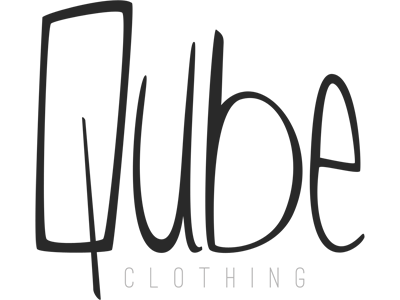
Qube Logo v2.3 (scaled)


Hey guys,
Another version of the logo. Some more updates done, mostly to the 'U'. Think I've got it to a point that I can live with for now.
The biggest hurdle now is the word 'clothing'. There seems to be a disconnect between the word-mark and 'clothing'.
I've tried a few other styles, including a heavier font with more tracking, a smaller, lighter font aligned under the 'UB', but I still can't come up with something I really like and looks to fit.
View the attachment for full-size. Would greatly appreciate feedback and suggestions :)