Clean Button UI on Light Background

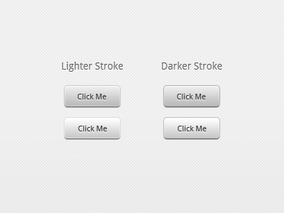
I always picture buttons as being either a primary action like a "Save" or a secondary action like a "Cancel", so here is my take on some clean buttons on an all-white background. To me, a bit of a gradient and drop-shadow are common conventions for an intuitive call-to-action. There really isn't much need to re-invent the wheel on buttons because that will just lead to UI confusion. I think the stroke preference is personal and can vary depending on the application's primary UI look and feel.
If you want the PSD, grab it here: http://j.mp/yn9Q36