Chestnut

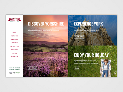


Thought it would be fun to show the notes sent to the client. My thinking process. Only showing the top section of the homepage design here
1. The design is nice and simple and relies on good images and snappy titles. Also uses the side nav as a constant.
1b. Branding and logo have been retained. Used the red for highlighting on buttons for example.
1c. Fonts used are Google safe. Oswald & Lato.
2. Pushed for the surrounding area or York and Yorkshire as part of the Chestnut park holiday experience.
3. Most of the images are from Adobe stock, had to patch up with shutter stock for others.
4. Kept the original navigation but added a contact us page.
5. Have simplified the accreditation logos to just trip advisor. Can add more but may look a bit cluttered. You also may want to add an address.
6. There is a page that shows how the buttons and overlays can be created.
7. Tried to simplify the text as much as possible but show users a large number of attractions available.
8. The buttons on the main images can either go to pages of the website or bring a user to the lower section of the home page.
9. The buttons on the “CHESTNUT FARM HOLIDAY PARK’ section, can go to various pages TBD.
10. The long email is an issue with that type of nav? Maybe use an icon and add social icons? Not sure if they have any social media pages.
11. Have used filler or repeated text for some sections.
12. If the larger image and slider option is preferred, then I would suggest adding arrows and/or bullets.
13. Added a light drop shadow to NAV edge.
14. Nice little animations would help the design.