sjia mobile pages 1

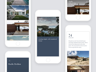
By allowing the blue half page to become transparent or opaque, and its position to be either side-by-side or up-and-down, a very natural and effortless responsive pattern emerges. This allows the hero image to remain close to its native aspect ratio regardless of screen size, shape, or orientation. Images remain optimised as the highlight of each project while interplaying with a unique brand pattern.
Branding and navigation were given multiple states depending on screen width and scroll status, allowing for clever use of sticky logo and links for effortless brand recognition and quick universal access to navigation.
New work from 2017 up in my portfolio!
See the whole case study: http://benek.nz/work/studio-john-irving-architects
Visit the website: http://studiojohnirving.com/
----
Need a design partner for your next big project? Contact me at benek.nz
Follow me | Website | Behance | Pinterest | LinkedIn | Twitter