sjia branding

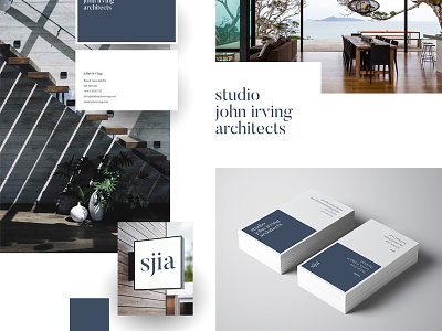
Our new brand identity for Studio John Irving Architecture was simple – defined by a monochrome colour pallet, a pair of logos (wordmark and initials), a single font pairing, and two unique design patterns that would permeate across web and print: a consistent white frame, and split half pages with blue colour-blocking. This combined to create a flexible system that would adjust well to all extreme variations in media size and orientation.
New work from 2017 up in my portfolio!
See the whole case study: http://benek.nz/work/studio-john-irving-architects
Visit the website: http://studiojohnirving.com/
----
Need a design partner for your next big project? Contact me at benek.nz
Follow me | Website | Behance | Pinterest | LinkedIn | Twitter