Cooper Union Remix

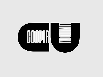

This is easily one of my favorite marks of all time and I would really love to see the Cooper Union abandon it's existing identity system, going back to the original logotype Herb Lubalin designed for them all those years ago. In the current design landscape, their has been somewhat of a "classic mark" resurgence (examples include: Mastercard, AdAge, Lufthansa, etc.) and it seems like the most opportune time to modernize this timeless design. This was my quick attempt to make it more typographically relevant and I would love to hear some constructive criticism/feedback from the design community (What other logos would you like to see revived?).
I've also included some of my "roughs" attached below the shot. What's interesting to me about this is, at a certain scale, it reads as just the C-U characters over the full mark, which makes it more digitally optimized/responsive.