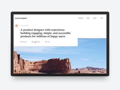
Personal site exploration two

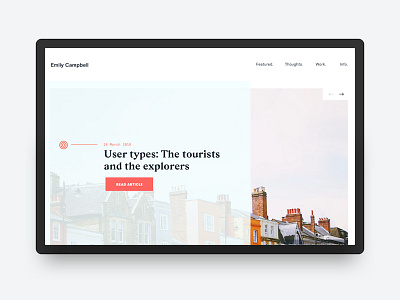
An earlier concept for my personal site that didn't make the cut. It looked pretty good on smaller screens but once you got outside a viewport around a 15" mbp it just didn't feel right. I love the way the colors play, though. I might use something like this for a different personal project or the header of a post.