Copper and Wild Ideas

Towards the end of last year, I started working with Dee from Copper and Wild. Dee is a product photographer and wanted to rebrand her business and relaunch in 2018.
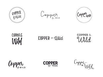
My brief was quite simple: pastels, geometric and typography. I began looking at the typography and I wanted to pair two typefaces together to generate a big contrast between the two words as I wanted to reflect how soft the metal copper could be and how uninhabited wild could be.