Risk Timeline Idea

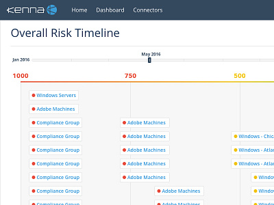


I dreamed up this idea and designed it in Sketch. It's a macro-level view for users to analyze huge amounts of data, while communicating a narrative over time about their cyber security risk (scored from 1000 - 0).
Here's a deeper explanation using Kenna terminology: an interactive timeline that shows every risk meter score (all-in-one chart). Customers can scrub the timeline bar to visually see how their remediation efforts have impacted the business from their first day using Kenna to the current day. When you scrub the timeline from left to right, all risk meters animate from the left side of the timeline (High Risk) to the right side (Low Risk). This page would scroll vertically to fit all content too.