


Recruitment Agency Redesign Concept


One of the projects I've been working on recently has been a homepage redesign for a recruitment agency. Since they don't want to be mentioned, let's call them 'ABC recruitment'.
ABC recruitment were looking for a redesign on their outdated site. The initial designer assigned to the project got stuck on his own design, something I think we all can relate to. He reached out to me for help.
I started the redesign from scratch, rethinking the UX flow as well as the interface design. Essentially, I decided to change all visual elements, from the colour scheme and fonts to the layout and imagery used.
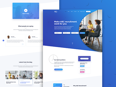
However, I kept the same features on the page as requested by the client. This meant that the visual had to contain a vacancy search module in the top section, the latest vacancies, a testimonial section and a blog feed.
I redesigned the site with a bold blue and purple gradient as a primary colour combination. This primary gradient was supported by different shades of grey to ensure the design became bright and 'open.' Also, I added drop shadows with a low opacity to give more depth to the page.
This approach resulted in a unique and strong brand, as well as visually interactive elements.
Don't forget to check out all the attachments.
I'm currently available for new projects for feel free to check out my site and get in touch.