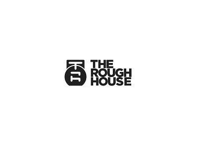
The Rough House Fitness Logo
My client for this logo is a personal trainer who trains people for different obstacle course races. He incorporates a lot of kettlebell exercises into his training. I wanted a logo that was bold and strong. I came up with the RH monogram first and then explored different ways to anchor the monogram. Once I put the monogram into the kettlebell, I noticed that it made a T at the top. The mark now reads TRH for The Rough House. I am happy with the final result and am excited to share more with you guys on this project down the road.
More by Austin Tapper View profile
Like

