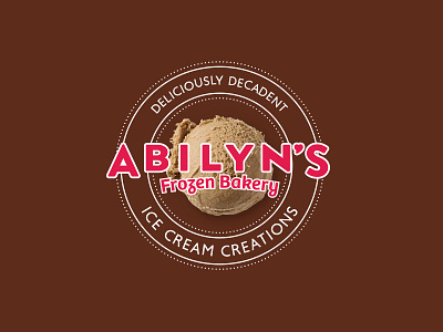
Abilyn Logo
Further refinement of the Abilyn's Frozen Bakery logo. Customer feedback indicated that we needed to provide a little more clarity on what a "frozen bakery" is. The words "ice cream creations" were added to indicate that they make all kinds of yummy things out of ice cream. I think it also gives the mark a more finished look.
The scoop in the background will reflect whatever flavor is being presented. For example, on packaging for a chocolate ice cream cake, the scoop will be chocolate ice cream. The second version of the logo, without the ice cream scoop, is for situations where there isn't enough space for the scoop and/or the print quality isn't good enough.
View all tags
Posted on
Feb 20, 2018
More by Jeff Sugarman View profile
Like


