Visdom Logo - Concept
Hi Guys,
VISitor Daily Operations Management (VISDOM)
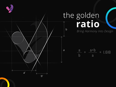
Our part in the project was to work on a Logo design for the Visdom brand. Here’s our design process and a walkthrough of how the final logo is created in Adobe Illustrator by using the golden ratio.
The whole idea behind Visdom is to transform conventional visitor management with the use of technology and provide seamless experience, enhanced employee efficiency and most importantly strengthen security.
As always, the first stage of the process was to scribble down some ideas and drafts.
We started work sketching out our ideas for the logo, our main focus for the graphic of the logo was to display the letters V and tick mark in a creative way that could be seen as an abstract mark, but also recognizable as the letters under closer inspection.
The final logo combines the strong bold graphic V and the hidden tick mark and the smooth shapes of the typeface making for quite an impactful design.
Concepts were supplied to Shiva and great feedback was received.
Thanks @Shiva..!
..... Guys share your thought on this..!

