Ellsi

Some brandmarks for a project in the works!
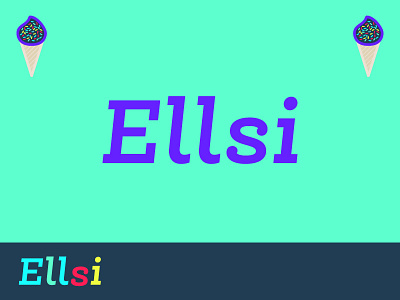
I can't seem to fix the optical illusion of the un-bottom-align red "s". At different distances and sizes, it always seems slightly off depending on how far or small. Any ideas or suggestions? It is currently 3px lower, but in this preview it seems too high. Anyway, I hope you enjoy these brandmarks, colors, and the type!