Selctd

Logo design and naming for a boutique that offers a curated range of items, from clothing to household products, carefully selected from global brands and independent designers for discerning customers with an eye for quality and manufacturing integrity.
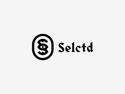
The logomark is the letter S made up of three eyes looking at different directions which represents the act of perusing a store but also signifies the meticulous attention to detail of the retailer. Moreover, it’s contained in a oval shape to give it a stamp of quality aesthetic.
In addition, the logotype choice visually compliments the sharp edges and curves of the logomark and it contains multiple cultural letterform styles within it, which references the eclectic and unlikely range of products that the retailer carries from around the world.