CXXM


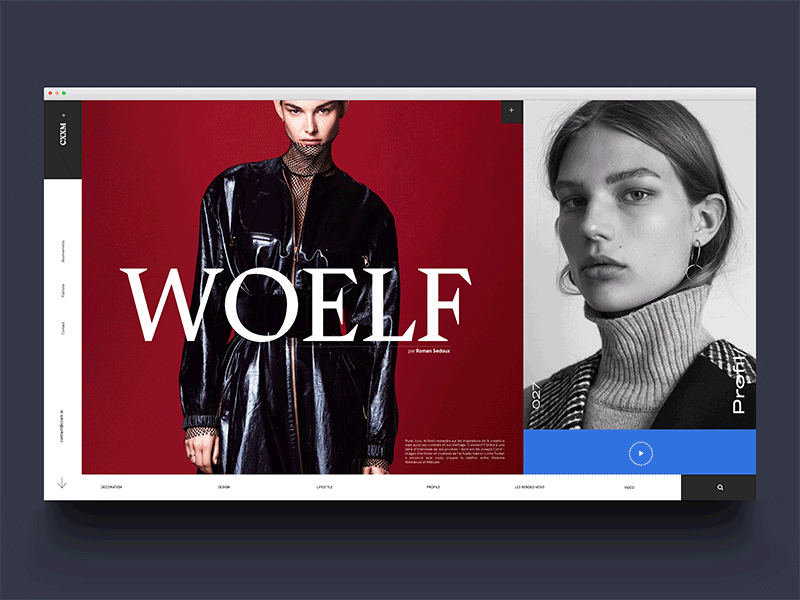
This is a shot from a project I worked on last year for an artist - modified it a little here to turn it into a shot.
My personal favourite thing here is the main font we used, it's an old font from the 70s that I found after a lot of searching around. There's something deeply satisfying about unearthing old fonts, and finding new ways to use them. After, I noticed that Loewe had utilised a variant of same font in their logo in their recent rebranding (think it's a different foundries interpretation). I think it's a font that's aged particularly well, unlike many of it's font peers, and dissimilar to many fonts of the era, it has a lot of contemporary potential.
Returning to the shot, nothing revolutionary here, but happy to share. Keep it 1000, and have a positive and productive day!