Whoosh Rebrand

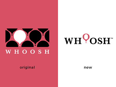
I really like the original design of this combination mark for a fictional women’s clothing line. One downside of this design is it’s heavy reliance on a two color scheme.
Also, the icon and wordmark when separated become lacking and less unique.
The redesign of this mark condenses and simplifies the original mark.
The redesign also enhances the versatility of the mark, allowing it to be displayed effectively in black and white and increasing the uniqueness of the icon.