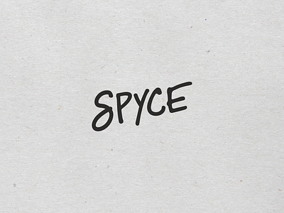
Spyce Final Logo
Excited to finally share where we landed with Spyce's logo! Though we experimented in many directions, a minimal signature approach felt the best to everyone in the end.
The signature nods to high-end culinary branding, while the style of the letters lends it to feeling casual and approachable.
Restaurant announcement here!
https://boston.eater.com/2017/12/14/16776280/downtown-crossing-robotic-restaurant-spring
View all tags
Posted on
Dec 14, 2017
More by JSGD View profile
Like

