Neighbourhood development logo

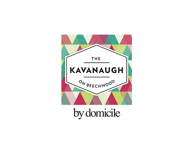
Design for a new condo tower. The patterned background represents the eclectic fabric of the community. The typography and badge were inspired by 50s atomic era visuals, as the site for this development was atop of a well-established, well-loved gas station owned by the Kavanaugh family.
The patterned colours switched up in their campaigns to keep the look feeling 'fresh' throughout the buying period.