Ebay (Concept)


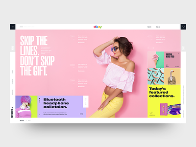
Another exercise. Mixed a lot of typographies in this one, and had a lot of fun. I read a while ago a brilliant article from @Bethany Heck where she makes a great case about how using a lot of typographies works so good as using very few (one or two). The reason is what I believe is the number law of aesthetic: clarity of intention. In design, grey areas don't work. You need to be either very bold, or very subtle. The goal is to show your intention very clearly. The clearer your intentions, the better (and more beautiful) your designs.
Let me know your thoughts!