Racing Rebound - Slight UI Suggestions


Nice work @Dima Shvedun. Since the goal of this project is to help one another always get better I thought I would do a rebound to suggest a few UI enhancements.
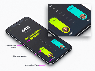
1) What if you placed the person's first name under their progress bar?
2) What if you added a distance marker to each progress bar so the user could see JUST how close the race is. This could help reduce the cognitive load on the user.
2B) It might even benefit to have the distance display above your progress bar in white and larger in font size so it can be read while the user is running or being active since it looks like this app would be used in that use case.
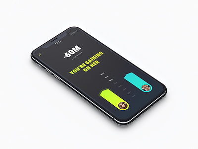
3) Also, I think adding the person's first name to your headline "You're Gaining on ... [first name]" creates a more personable experience to the UI that was originally missing.
4) What if you brought more contrast to the progress lines that stem out from each distance number in between the two contenders?
5) Lastly, how do you envision the user getting back to the previous screen since I'm assuming this is not the only screen in the design of your app/product? I know there have to be more user options than "Give Up".
Hope this helps inspire more great work. Look forward to more post from you.