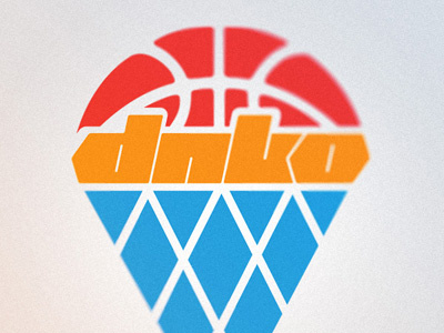
DNKO blog logo 3
The original logo was triangle-based, so I tried to update the new one around it. The new typography seemed perfect for the idea of the retro hoop/net design under it.
I think I need to work around this one a little bit. It reminds me of a ice cream cone too much :)
View all tags
Posted on
Jan 22, 2012
More by Tomislav View profile
Like

