Distantly Yours Logo Redesign—3b

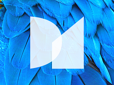
Like the original logo, these shapes are abstractions from the letters, “D,” and “Y,” the initials of Distantly Yours. I am interested in exploring textures from nature. This particular treatment feels a little bit too Miami Vice to me, but it made me chuckle a little, so I’m sharing it anyway.