


Burning Barn Rum Bottle


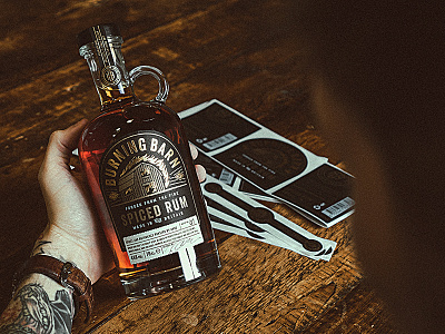


Beyond stoked with how this packaging and brand project turned out. Two variants of Rum, Spiced and Smoked represented by the foil colours carefully chosen. The colours immediately jumped out at us, Gold perfectly representing the fire and spice, and a cold slate/silver doing the same for the charred and smoky alternative.
Although labour heavy, the four individual labels that are applied to the bottle, (batch label by hand) help bring through the same quality and personal touch that goes into the rum.
We're currently planning the final product shots so expect to see the pair on here soon.
Check out the attachments to see some of the finer details held in the foiling and paper stocks.
📸 by @Nathan Riley
✋ model yours truly.
See what the team have been up to: 👀