On boarding UX Flow – UI treatments

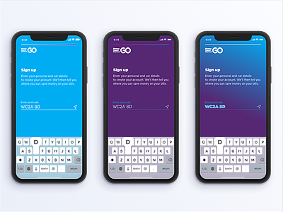
Further work into the previous UX on boarding shot. Here's some experiments into how colour and a slight font change can bring out a brand personality.
One example looks more "cool and fun". Another looks cleaner, reducing cognitive load, thereby appearing to feel easier to use. While another is "on brand".
Can you guess which is which?
Left to right... 1 - 2 - 3?