Meager suggestions

Patrick, just some very mild suggestions. I think your logo is closing in on done, but if you've been staring at it for any length of time, chances are you get blind spots like I do when i vector it up.
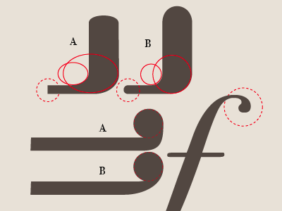
Try comparing some of the curves again and choose which style to go with. Here are some examples.
I really love the graph paper style shape of your logo and prefer it over some that are over produced. I love custom carved shapes, especially in illustrator.
Cheers!