Tourelle Business Cards

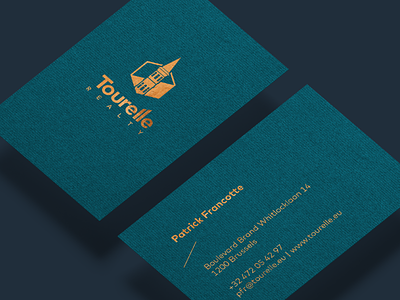

I proposed a rather more appropriate, confidential and luxury look for the real estate agency. This way, the client distinguished itself from the rest of the competitors. I have advised to use a copper to remind of the large copper lamps throughout the office, as this became part of the clients' visual identity. Paper wise, there was a use of a complex mix between blue and green, both comforting colors that match with the brown copper. Business cards were printed with a hot-foil press.