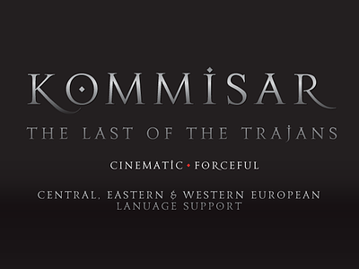
Kommisar
Kommisar is a typeface loosely based on the inscriptions on the Trajan capital in Rome and informed by the structural sensibilities of American signpainter and lettering artist Father Edward Catich. Perfect for use in advertising, movie posters, movie titles, identity design, or any work needing to convey a sense of authority- Kommisar is also perfect for music packaging and promotion design.
Kommisar is perfectly at home in movie titling, band logos across the spectrum- from metal to hip-hop, as well as in use for packaging work. It contains a full Western, Central & Eastern European language character set.
Kommisar was born out of designing a logo for a black metal band based in Tokyo- in lieu of the usual spiky treatment, the band wanted something lean and super-classical. Halfway through the design process, the band changed their name, and with the subsequent name change, I had more than half of a whole alphabet designed. I decided to fill out the remaining character set, fiddled with spacing and alternates, and lo and behold- this font was born.
Kommisar looks to antiquity, yet is decidedly contemporary. The base is reliant upon well-proportioned classical Roman capitals, yet small details such as the diamond shape within the uppercase "O" and the chisel-shaped dots on the lowercase "I" and "J" give it a playful, yet sinister nuanced finish.


