Sweet pud'n 04

Here are some packaging elements for a London-based subscription retailer who's launching a new product line that tastes like various desserts.
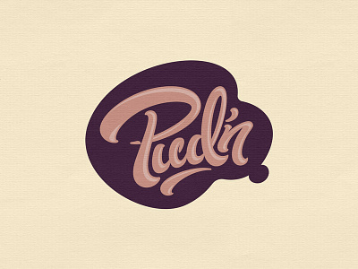
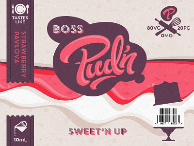
If you've been following along, this is how the holding shape I showed before will come into play. "Boss" is the name of this particular flavor. Each flavor name will display in the little extension off the main holding shape.
Regulations prohibit the depiction of actual foods on this packaging, which was a challenge since this line of products is inspired by specific desserts.
My solution was to create a "super-duper-closeup" background texture that hopefully elicits the *feeling* of each specific dessert flavor.
And a set of complementary baking-inspired icons rounds out the visual language. They didn't say we couldn't depict food implements. 😉
Z up those deets.
More to come…