


Font Card Contrast


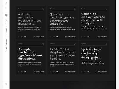
So I realised I messed up the shot, it was supposed to show the contrast options for even more context. So here it is.
The big focus on the UI/UX here was always providing various options to allow designers and font users to apply context to how they might use each font, as opposed to just huge font listings with no ability to relate.
