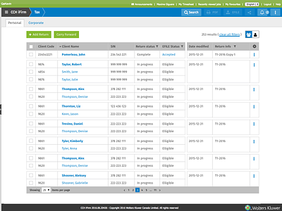
iFirm Tax - Return View

Hi all!
As I said in the Return Manager post, here is my second shot about iFirm Tax. Because of the competitive environment we are in, I can't show too much.
Quick Action
The buttons at the right of the breadcrumb are always at the same place. So in this return or in the return manager, the user does not have to search for them.
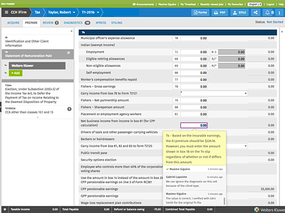
Steps / Tabs
The left tabs represents logical steps to do a return. The Acquire, Xpress and EFILING tabs have there own view (I won't show them). The Prepare, Diagnostics and Review all change the left panel only. The reason that only the left menu change for these steps is to keep context as much as possible for the user. And clicking on a element in the left menu will target the right form / cell.
Left Menu
The left menu was a big part, how to show up to 3 level of information without making it too heavy for the user? How make this easy to have an overview at the same time? So all multi-level elements can be expand or collapse depending of the user needs. The fact this menu is fully resizable and collapsable was to consider all the way in the design.
Form
This is actually the only part I didn't do anything. The design rules were made before I began working on this project. The only things I worked on was the tooltip for the Comments and Review Marks and the fixed header to help the user see which form is open when the left menu is collapse.
Monitor
The monitor is really important to see if anything was missed by the preparer. It gives real-time insight on specific cells value. The user can show or hide cells with the gear menu.
And more to come
We are still working pretty hard on new features for our users. Can not say more.
Hope you enjoy this view tour!