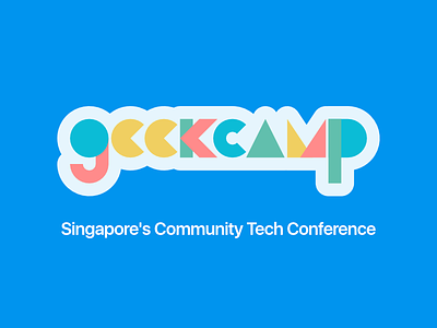
Geekcamp SG - logo proposal
Update: This design will now be used since quite a lot of Geekcamp SG folks liked it and voted to use it.
---
Was working on this for the past few days, realised it's not needed anymore, so ¯\_(ツ)_/¯
Anyway, I try to make the design more *fun* in a way. Vibrant yet not too distracting. Rounded and has sharp edges at the same time. The 'e's are like pacman's. The 'A' follows the current https://www.geekcamp.sg/ logo (a green tent).
View all tags
Posted on
Jul 13, 2017
More by Chee Aun View profile
Like

