AMDEX Logo Redesign (Proposed)

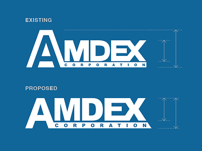
As an exercise, I redesigned the AMDEX logo to improve its readability (especially at smaller sizes), simplify the lines, and strengthen the brand with more uniform, balanced and stronger typography.
The letter height is now even along the top, and the initial “A” is simplified (no more A within an A), and the baseline text “CORPORATION” is now larger and more readable.
I added one flourish: the baseline now is a continuation of the diagonal of the “X” in the lower right.