Branding a cattle farm


After 13 years of bootstrapped business, you accumulate quite a number of logo variations, font combinations, and colors that can get out of hand quickly. I wanted to simplify everything they had going on, give them a identity that felt as though they'd been around for decades but was still flexible enough for all of the various modern business segments they're a part of.
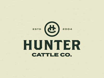
As you can see in the attachment, I proposed making quite a number of tweaks and changes, most notably the change of their primary mark from the "family" (boy + man+ cow) to the HC monogram. This monogram had been in use since the early days, but had always been pushed to the background to serve as a badge here and there or as you see, a secondary mark within the primary.
- - - - - -
Let's make something awesome!