Equity Advocates Logo Exploration

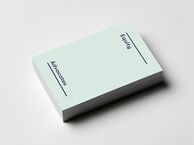
This logo embodies the idea of equality as a framework for action by encapsulating the logotype in a hyper-minimal logomark consisting of two parallel lines which evoke an equals sign. Ultimately this one ended up on the cutting room floor, but there is something in its simplicity that felt worth sharing.