Columbus Flag Redesign Revisited

It's been a while since I worked on anything relating to the my personal pet project. Yesterday I had an a-ha moment about the design. I kept getting comparisons to the indy flag with my last version, which admittedly were justifiable.
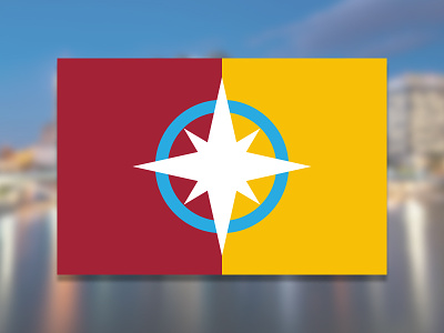
My a-ha moment was realizing don't completely dump the current flag design, just make it better with some of the elements I already had, so i made the following changes:
I fixed my star design to be more in line with compass rose which ties back to the sailing motif in the current flag.
The star now links back to the stars in the current flag
The stars cardinal direction highlight High and Broad as major thoroughfares
I split the flag vertically between the current flag's dominant colors (shifted a little bit to be less abrasive) like how the rivers split the city.
I flipped the order of yellow - red to red - yellow because our state color is generally red so it made sense for it to come first.
I made the star white and centered it like how white centers the current flag.
The blue circle brings over an element from the current flag and each half of the blue circle represents one of the rivers.
I'm much happier with this design vs my previous one. This feels like it'd have a much better chance of being adopted. Follow columbus peeps let me know what you think.