


Double-Leaf Design Using Typography Principles

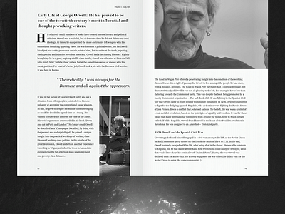

We are no born masters of good taste, but self-education can help improve that. At Zajno, we played with leaf design and typography relying on explanations of its effective usage in “Form of the Book” by Jan Tschichold. The double-leaf book design about George Orwell is an example of applying the theory practically. Share your expertise with us. Were we successful in combining fonts and choosing an appropriate typesetting method? We welcome your feedback.
Press “L” to show some love!
Don’t forget to follow Zajno on social media and feel free to drop us a line:
Facebook | UpLabs | Twitter | Instagram | Zajno | Medium