Rectenwald Brothers

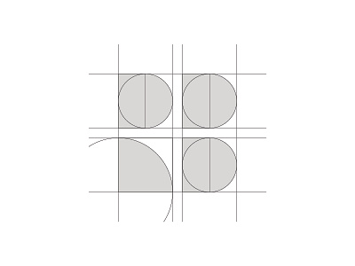
The Rectenwald Brothers (www.rectenwald.com) lettermark, derived from its name, abstractly combines the letters “R” and “B” from the negative space of its geometric forms. The result is a highly professional, memorable, and established design, reflective of Rectenwald Brothers’ long-standing presence in the industry. Additionally, its geometric construction and repeated shapes convey order, attention to detail, stability, and trust.
Created at Stewart Design.