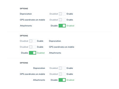
Toggle list alignment options
3 options for aligning toggle list
Pros and cons to all.
Pros
Option 1 - Labels are in expected place. Fits pattern of other items on the page.
Option 2 - Labels are left aligned and will always be same distance from the form element.
Option 3 - Labels are in expected place that fits the pattern of the other page form components. Toggle will always be same distance from labels.
Cons
Option 1 - The label can end up too far from toggle if some of the list items are long.
Option 2 - Everywhere else in most apps, the labels are to the left of the form element.
Option 3 - Right aligning is unexpected. And in this case, leaves weird space below the heading.
Not sure which I prefer. Anyone have a best practice recommendation here?
More by Carri Craver View profile
Like

