Atrium // 3

The Atrium, whose name comes from its great structure and its vocation of sharing between neophytes and initiates, is a whole new cultural center. It is considered ad a triple space dedicated to dance : headquarters of a company, unique formation structure, place of representation. The problematic was to give it a strong identity in order to anchor it in the heritage of the city, and to make it a place of privileged interactivity.
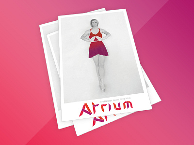
The second axis of creation is concerned with the plurality of functions of the center. Its geometrical architecture makes it possible to observe the recurrence of a ternary rhythm, symbolically linked to the affect. This logotype resumes the fragmentation generated naturally by a folding, highlighting a visual in volume. A dynamic and acid color code has been defined and declined in graphic charter, with a series of monochromes, implemented on business cards, stationery and program.