DIN-DIN

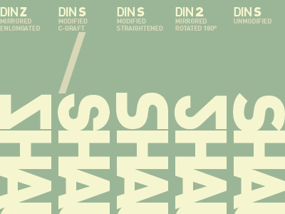
DIN's unmodified S (far right) isn't feeling geometric enough for the rest of the very square characters in my name so I've been playing with some alternatives. The mirrored and rotated 2 (right) is too sophomoric. As is the mirrored Z (far left). The middle S feels too Star Wars.
I think the S that's been grafted with the C (left, below the slash) strikes a balance between geometric reduction and the natural letterform.