LifeServices Style Moodboard

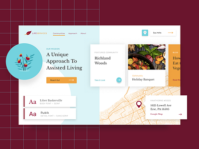

We had the chance to work on a project that turned out to be really fun as we iterated through the design process. It's for a set of Assisted Living (Retirement) Communities in Ohio and Pennsylvania but they're really trying to push for a more modern brand similar to Harrys or Casper.
Our team was able to maintain the two dominate maroon and orange colors from the existing brand but added an additional baby blue to give a bit more pop. Also added illustration, patterns, simplified typography, and shadowed cards to modernize the whole feel.
We're just now wrapping up the site, so expect to see more shots in the next couple of weeks!