Walt Disney


Yesterday in the mail I received a 1986 Graphics Standards Manual for The Walt Disney Company. And it's kind of amazing how consistent they were at this time.
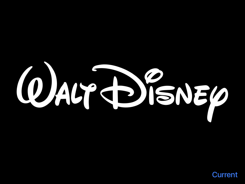
Now, TWDC has a hundred subsidiaries with different logos and stylizations. I'm not out to solve that, but when looking at the classic "signature" logo for TWDC, I saw room for improvement. So—just for fun—I took a closer look and made some modifications.
Currently there are at least three variations in the company. One for the company itself, one for the Animation Studios (sketch), and one for Walt Disney Pictures (thinner, rounder).
But where these new ones solved some spacing and legibility issues, the company version has not changed.
Many years ago, on comics and posters, Disney artists drew a lot of different versions of this logo. Wherever it needed to be, they drew their own. There wasn't so much of a standardized version yet. But at some point, it became vectorized and stamped on everything.
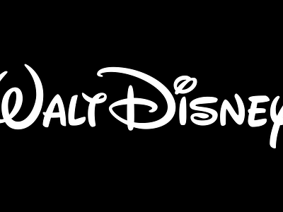
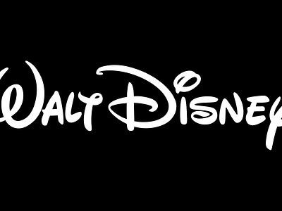
While super iconic, there are some aspects that I feel could be improved. In my version, I've redrawn the entire wordmark with attention specifically to legibility. Characters still have a bounce, but they are more evenly rested on a baseline. Their counters are opened up to help at smaller sizes. It's a tiny bit thinner as well, to give better contrast from the background.
All in all, this was a fun little exercise for a company I love dearly. It's one of those changes you might not notice if you didn't see them side by side or flickering between each other, but it's a change I think is worth making.