Harmonious UI color palette

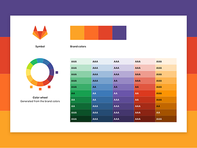
Currently, the chromatic or full colors (i.e. non-grayscale colors) used throughout GitLab’s user interface are:
• not harmonious with the brand colors (the most obvious example is the pinkish-red or amaranth)
• look inconsistent as a whole
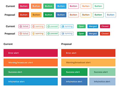
To tackle these two problems and contribute to a more polished UI, we are redefining the existing color palette by extending the brand colors. The color palette was also tweaked manually to pass the Web Content Accessibility Guidelines (WCAG).
We encourage you to look at the issue page for more images and context on this work: Change chromatic/full colors to a more harmonious palette (gitlab-ce#28614)
Give us your feedback so we can improve it together. Thanks!