Mapping Terrific Scientific

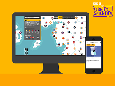
Only 15% of young people aspire to become a Scientist. This is part of the wider STEM crisis happening in the UK. Terrific Scientific is the BBC's new science campaign for Primary Schools aimed at trying to change those perceptions. Through enabling Schools to take part in exciting UK-wide investigations and seeing their results plotted on an interactive map.
The K&L UXD team produced the UX, UI and visual design of the map. Taking into consideration that the data visualisation of the investigation results needed to resonate and deliver learning outcomes to a young audience, 9-11 year old pupils. The map enables pupils and teachers to interpret trends and correlations from the investigation data points. We designed a pop up modal window to house the individual school and class investigation data.
We extensively tested each of the data visualisation solutions to make sure our audience understood what was being represented and how to interact with the map. These testing sessions involved both primary school children and teachers.
Keep an eye out for the next Terrific Scientific Dribble post about how we encapsulated the investigations through animation…