Setmore - Modal windows


Based on observation, people generally hold their phone one-handed, using their thumb as the primary navigation tool. The design of most phones and apps actually emphasizes right-hand thumb usage.
Yet modal close buttons are typically placed in the upper right corner, with one-handed use, stretching your thumb to the top right corner of the screen is tough.
This poor close button placement also applies to tablets. Although the screen and the button are larger, it’s still unnatural to shift one’s sight back to the top of the window in order to continue reading.
So if you’re using a modal window for the right reasons, keep these design tips in mind:
- Place the close button on the lower right of the screen
- Avoid making users scroll in modal windows
- Use a motion effect to open and close modal boxes to provide a contextual understanding of where the window came from
- Follow the industry standard for button sizes
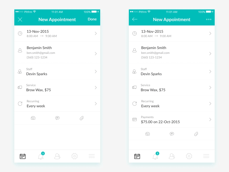
This is one of the mobile apps we designed at www.plat4m.com. As always, we were responsible for the UX flows, User Interface Design, Micro-Animations and more.
Design by @Majo Puterka