Feedly App Logo and iPhone/iPad icon Ideas

Initial brainstorming for a refreshed identity for http://Feedly.com
The brief is quite involved so I'll do my best to sum it up. It ideally needs some familiarity of Feedly, a superb way to manage, customise, share, organise and view all your feeds, news and headlines.
"feedly organizes your favorite sites into a fun, magazine-like start page." Based on Google Reader, RSS and Twitter.
They want Feedly to be viewed as this colourful, vibrant and fun way to manage all your precious feeds. A place you want to come and visit on a daily basis, to feel at home and feel enthused to spend time using and reading what is in your feed collection.
That you cherish and be inspired by your feed collection, much like you would cherish, store and collect printed magazines. It's not just a place to store feeds, it's your own custom magazine. Rather than the more dull interface of Google Reader or other similar RSS feed readers.
And so off the back of that, it makes sense that the look and feel creates this sense of 'enjoyment' both via the web application and also the soon to be released iPhone and iPad app.
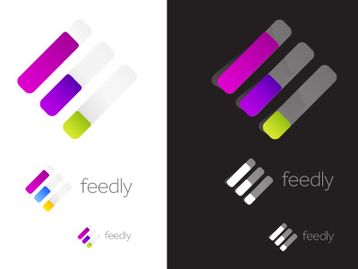
THe idea for this concept has come from the post-it sticky tabs you can get to mark and save pages for future reference. That many of us like buying bits of stationery to manage our lives, pens, pencils, markers, post it notes etc etc. So there is a direct tie in here, the virtual tabs are literally saying this is where you can bookmark, store, bookmark and share all those feeds you have.
They conveniently form the 'F', whilst the tabs 'will' be fashioned to look like they are just peeling away towards the user, the semi opaque clear portion stuck down.
The exciting prospect is that on the iPhone 4 Retina display, the coloured tabs 'app icon' will literally 'jump' out at you, begging for you to grab the ends with your fingers on the screen.
The mark needs to be simple as it will be used for the main logo, all icons even the favicon size, and icons for the Safari, Chrome browser extensions. So it needs to downsize whilst retaining the overall identity where ever it is used.
As usual, a first concept, rough around the edges. the artwork is just for initial brainstorming, so all the pixel details are not 'perfect', just to show the client my initial intentions.